design @ Button
Reimagining the Button Brand and Website
This is a company branding and storytelling project and a website design project. I’ve combined them to better tell the story.
Button, like many startups, was figuring out its identity and product at the same time, while continuing to clarify the company mission. It was a confusing time because there were a lot of chicken-and-egg moments.
The Team
- VP of Marketing, strategy and content
- Marketing team, copywriting
- CEO, CRO, CIO, stakeholders
- Web developer, all things engineering
- Me, design lead
Visual Identity
The marketing team had already done a lot of work defining Button’s brand voice–one that was bold, modern, trustworthy, and human. However, at this point we also commited to position Button as a tech company. Button cannot be everything to everyone; the company is a tech company, and its products are for businesses that want to succeed in the mobile commerce space. We needed our target audience to know that on their first impression.
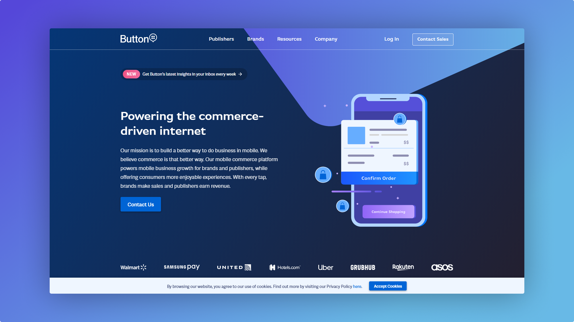
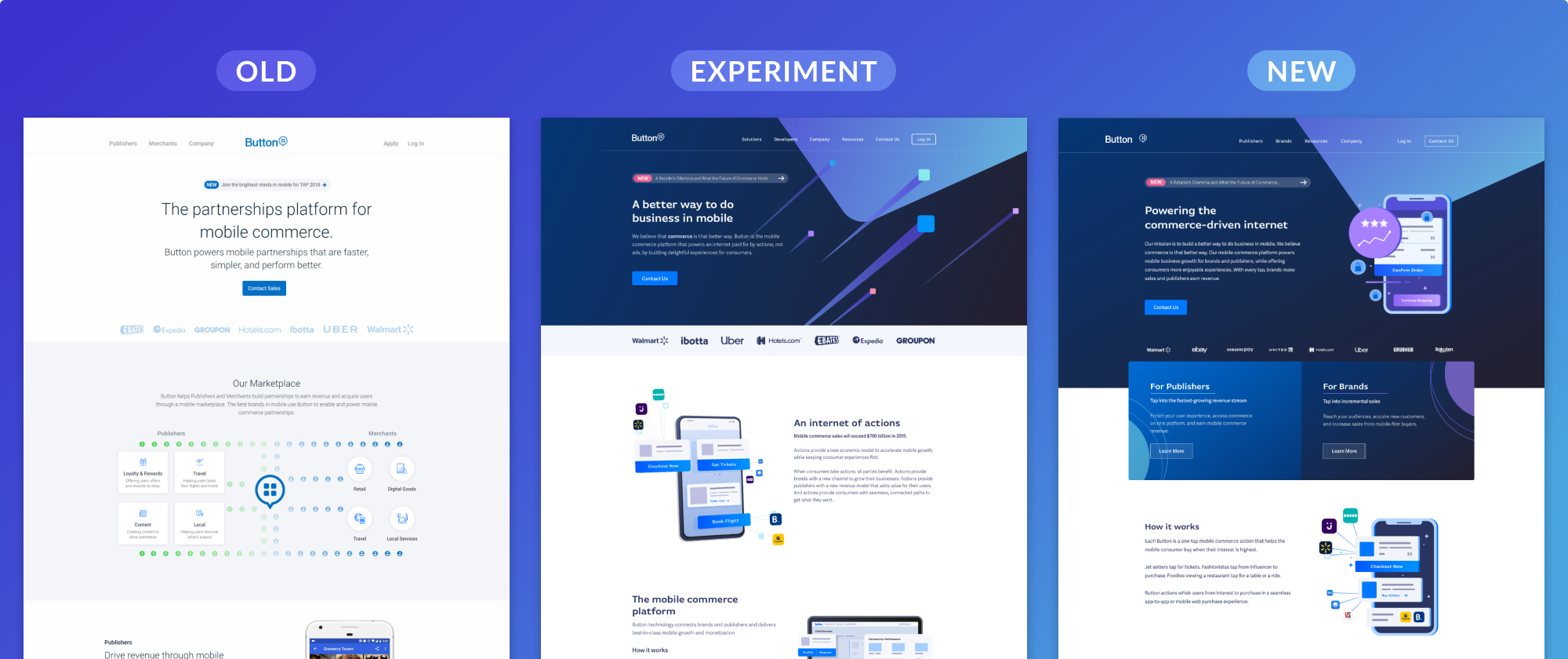
In March of 2019 I redesigned the Usebutton.com homepage. It was a blue sky project intended to experiment with a new visual branding direction that would show Button as the tech company that it is. The redesign incorporated bolder colors, illustrations to visualize Button’s technology, and clearer messaging.
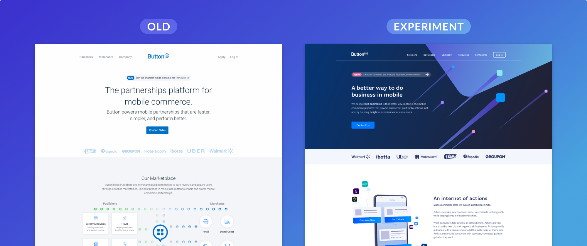
After the page went live, I tested with users to understand how they described Button based on the way the site looked. I identified areas for improvement as we addressed the rest of the website. At this point, I also took a first pass at codifying the new visual language so others could understand and use Button’s visual identity too. This was also key to be able to art direct illustrators who helped with the rest of the website.
User Journey
With a visual direction established, I focused on the user experience and journey. We already knew that folks had trouble understanding Button, but we needed for information to understand what problems to address. Interviewing the sales team and customers revealed that folks usually ended up landing on our homepage after already hearing about Button. Typically a website visitor has already talked to a sales rep, attended a conference rep, or has talked to another Button customer. However, once they got to the homepage it wasn’t clear what to do next.
Additionally, Button has four target audiences, and while it’s easy to tailor information in conversation, the website navigation did not help the user find the content for them. Instead, the homepage only gave the option to contact sales, which most visitors are not ready to do right away.
Translating into the design
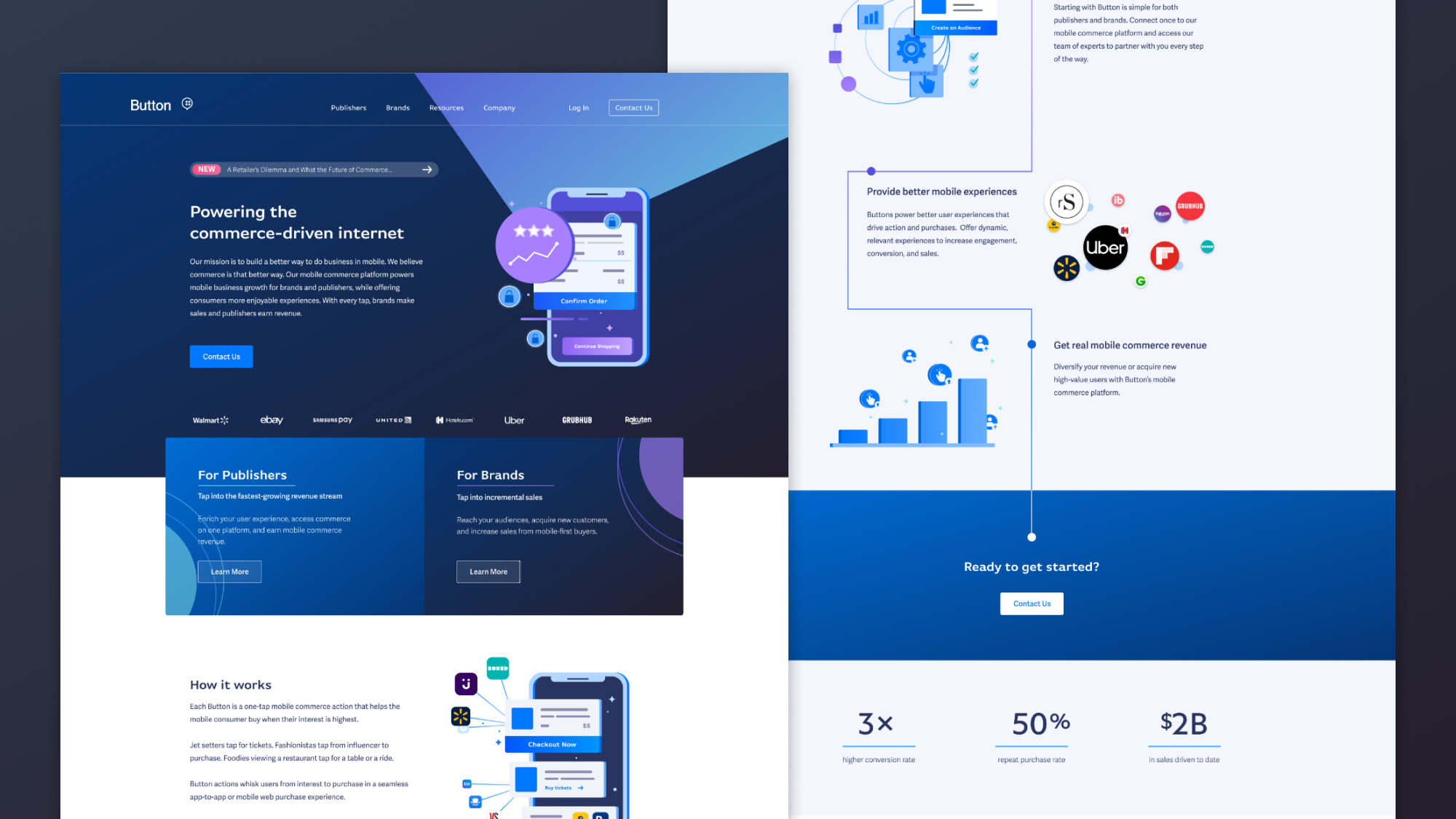
To give the visitor the lay of the land easily, I redesigned the navigation UI to give the user a holistic view of the site structure as well as descriptive information. The megamenu pattern is also common among B2B companies, so I was confident it would be easy for users to understand. I also added an area on the homepage that immediately describes the two sides of the marketplace to the user, with the assumption that the user likely already knows which side they are interested in.
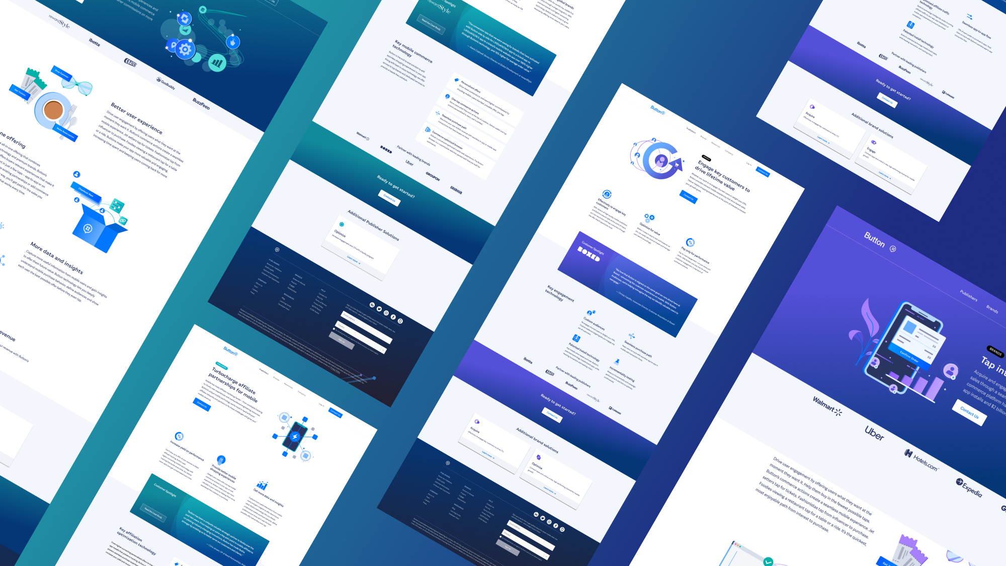
As users navigate throughout the site, there is also a color shift between the different sections–the homepage and other default pages, the pages for Brands, pages for Publishers, and the company section. Again, with content for various audiences, it was important to give cues to visitors as to where they were.
Outcomes
Typically, metrics for a marketing site are around traffic volume and conversion rate. For this project though, we wanted to improve the quality of the conversion. Rather than wanting every visitor to contact sales and clutter the pipeline, we wanted more qualified leads to contact sales. We measured this based on number of leads that met the marketing team’s criteria. I was also looking for qualitative user feedback and no increase in usability issues based on Fullstory analytics.
What Came After
As with any product, there were plenty improvements that we designated out of scope for the project, but wanted to address in a future iteration. The ones we later took on included:
- Integrating Contentful CMS. We were already using Contentful elsewhere to empower the marketing team to own content, and we wanted to enable this functionality in parts of the website as well.
- Comprehensively auditing for accessibility. Although I design with accessibility in mind, we didn’t track what we tested for accessibility and what we did not during the project. After content updates, the engineer and I systematically audited and updated the site for WCAG compliance.
- Defining illustration guidelines for scale. Three illustrators worked on the website images, including myself, and although we aligned stylistically, we didn’t have guidelines for creating future visual content. I also wanted to clean up the graphics and share with the team so they could be used in other applications.