design @ Button
Humanizing the Button Company Pages
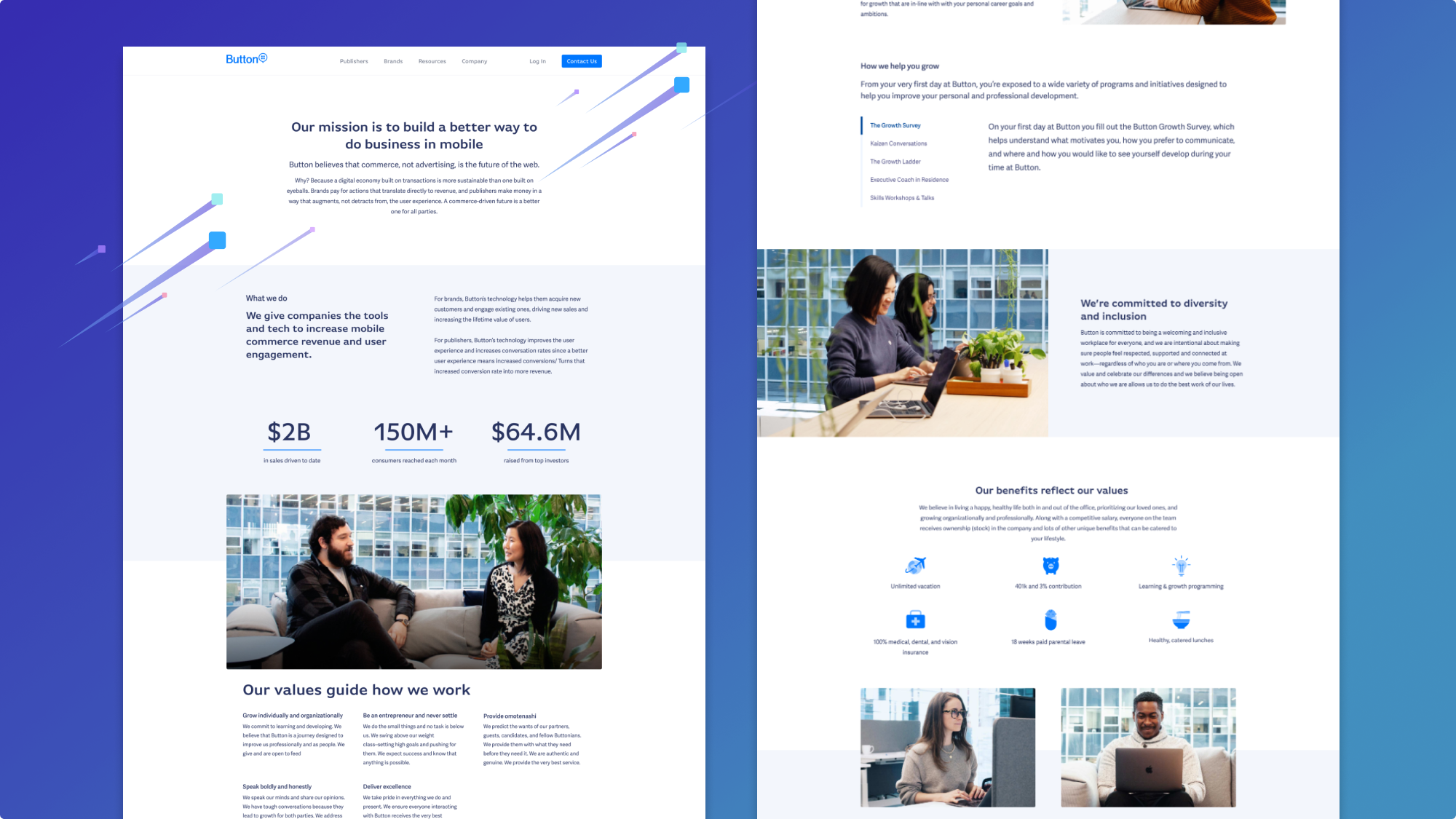
I collaborated with Button’s People Team to redesign several webpages that shared who Button is as a company, what Button does, and what potential job candidates would want to know. Part of this project was an aesthetic update, since Button’s employer branding doesn’t look exactly the same as the core brand, but the bigger part of the project was restructuring content to easily give visitores the information they wanted.
The goal of the website was appealing to potential candidate, press, and investors and making it easier to navigate content.
Team
- Me, designer
- Web developer - engineering
- People Team stakeholders - CPO, manager of people ops, people ops specialist
- Marketing Team - content strategy, comms manager
Aligning a New Team
I didn’t often work with the People Team, and I knew they cared a lot about this project, so I started with a few alignment exercises for our kick off.
Aesthetic Alignment
Since I was working with a new team of people who were invested in how the end result would look and feel, I started us off with a Gut Check Test to start a conversation around aesthetics. The test itself is fun, and what is really great is the resulting discussion. It provided an opportunity to start using the same terms to refer to visual patterns and styles so that feedback in the later stages would be clearer.
User Interviews and Metrics
I leveraged our recruiting team to ask candidates 2-3 lightweight questions, with the understanding that these were very biased answer. I also interviewed new hires to get their impressions of the web pages—-again, biased since these folks ultimately were attracted to work at Button. For other target audiences, I asked our marketing team and sales team for input. This was not the ideal research process, but it gave me something to work with. I also gathered some usage data—page visits, device analytics, and such to understand what our audience was looking at already and have a benchmark.
Design Workshop
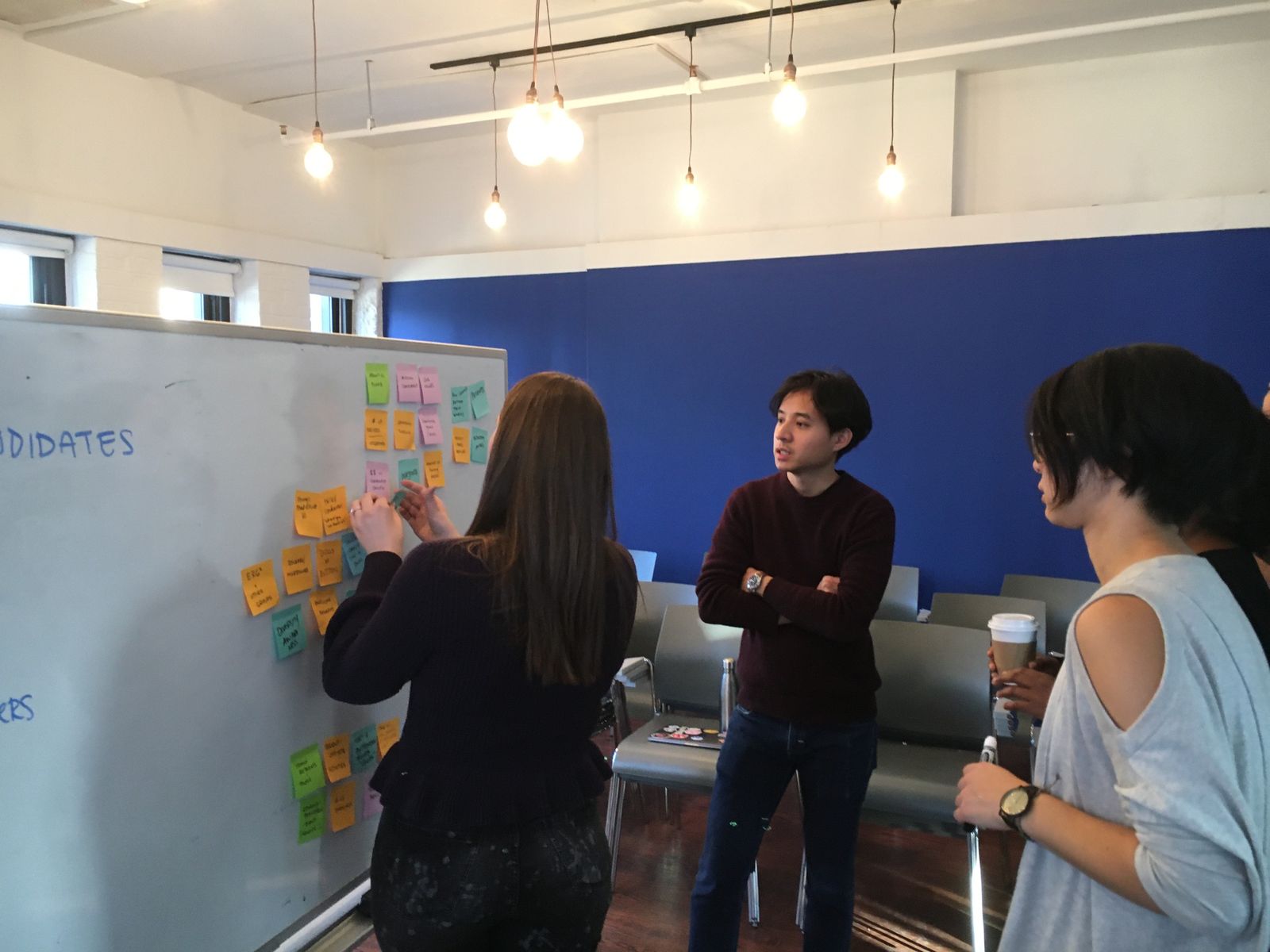
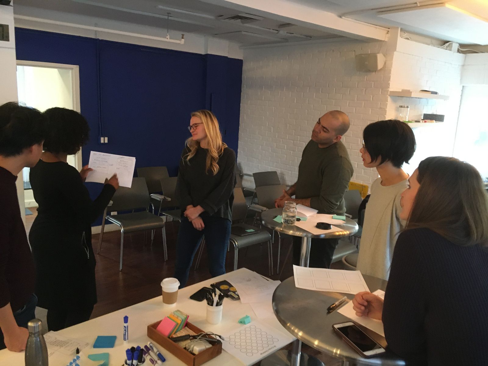
With insights from the user interviews and the results of the Gut Check Test, I ran a workshop with the team to brainstorm the type of content we expected to see on the website, and some potential layouts-—how might folks organize the info?
I used a modified version of the process from Brad Frosts’ write up on Establishing Design Direction. The design workshop was challenging because we were crunched for time—-in a meeting-heavy organization, finding a 2-3 hour block of time for 5-6 people is very challenging. Additionally, for participants who aren’t used to design or creative work, I had to reframe the problem multiple times, whether by showing examples of web page sketches, or asking lots of prompting questions to get the brainstorm going.
Visual Design and Results
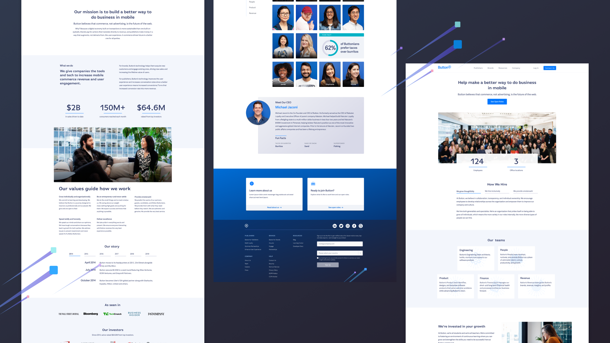
All the hard-earned inputs provided great raw ideas for when I put together the page layouts. Front loading the alignment exercises helped make the stakeholder reviews at this stage smoother. The designs reflected the goals and decisions we discussed, and when folks gave feedback, they drew from the vocabulary and discussions from earlier to communicate clearly.
One of the deliverables included fun icons to represent the employee benefits. I created some of these and art directed others created by Jessica Braga.
![]()
The web developer, Jeff, built out my designs in small pieces so that we could roll out small changes quickly and monitor for any bugs or performance changes.
After
In an ideal world, there is a comprehensive benchmark to compare results to. In this case, we didn’t have benchmark metrics. After the pages went live, I began to work on developing a testing plan to benchmark the performance of these pages in a way that aligned with the People Team’s goals.